 Portal
 Home
Home Latest images
 Log in
The new logo
+17
Arnold T Blumberg
konstantin
Starfighter Pilot
72lf
Patrick
Johnstone McGuckian
Zoltar
Dave Webb
warped
Graymalkin
Rich Flair
barnaby morbius
camino real
Lee Carey
Lucy McGough
The Co=Ordinator
Nick Barlow
21 posters
Page 2 of 2
Page 2 of 2 •  1, 2
1, 2
Re: The new logo
![]() by The Co=Ordinator Tue Oct 06, 2009 12:06 pm
by The Co=Ordinator Tue Oct 06, 2009 12:06 pm
Thanks Arnold. It's certainly had what may be considered a surprisingly "Unwrinklylike" response today.
Is this a portent for the future?


Is this a portent for the future?

The Co=Ordinator- Tony the CyberAdmin
- Number of posts : 11054
Age : 64
Location : On a box, in TC7, long long ago..........
Awards :

Registration date : 2008-11-03

Re: The new logo
![]() by Graymalkin Tue Oct 06, 2009 12:32 pm
by Graymalkin Tue Oct 06, 2009 12:32 pm
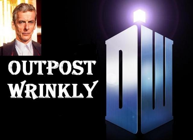
I suspect it's gonna be harder to make an 'Outpost Wrinkly' logo out of, anyway - although the letters are there for an OW TARDIS, I suppose...

Graymalkin- Justified and ancient
- Number of posts : 981
Age : 50
Location : (Lucifer over) Lancaster
Awards : poster award
Registration date : 2008-11-06 -

Re: The new logo
![]() by warped Tue Oct 06, 2009 12:51 pm
by warped Tue Oct 06, 2009 12:51 pm
I object to that. Seriously.The Co=Ordinator wrote:It's certainly had what may be considered a surprisingly "Unwrinklylike" response today.
I don't recall any rude words, or much in the way of unsupported knee-jerk negatives.
It's been analyzed and reviewed based on its historical context, actual features, and practical usage.
Wrinklies are not mandated to uphold the cheery or positive if the material discussed does not support it.


warped- Properly wrinkly
- Number of posts : 218
Age : 63
Location : Carolina in my mind
Awards :
Registration date : 2008-11-15
Re: The new logo
![]() by Jennyjenkins Tue Oct 06, 2009 12:52 pm
by Jennyjenkins Tue Oct 06, 2009 12:52 pm
I'm very underwhelmed - I had to go back and check that it actually said doctor who - failed to register it the first time.
I don't really like the lack of colour - like Warped I'm not sure how this will work on the merchandising.
I like the idea of the Tardis bit but not so much the execution.
Please please please don't change the lovely Outpost Wrinkly banner - this one is pleasing to the eye and comfortingly familiar.
I don't really like the lack of colour - like Warped I'm not sure how this will work on the merchandising.
I like the idea of the Tardis bit but not so much the execution.
Graymalkin wrote:I suspect it's gonna be harder to make an 'Outpost Wrinkly' logo out of, anyway - although the letters are there for an OW TARDIS, I suppose...
Please please please don't change the lovely Outpost Wrinkly banner - this one is pleasing to the eye and comfortingly familiar.

Jennyjenkins- Justified and ancient
- Number of posts : 2079
Age : 64
Location : Somewhere else
Awards :

Registration date : 2008-11-03
Re: The new logo
![]() by stanmore Tue Oct 06, 2009 1:43 pm
by stanmore Tue Oct 06, 2009 1:43 pm
Lee Carey wrote:
Working on the Celestial Toyroom cover and redrawing the classic Tom logo in illustrator made me appreciate the amount of thought that had gone into it, and how uniquely the designer had solved many of the problems inherent in the Doctor Who logo (in particular, the C, T, O letter spacing and the fact that the WHO part will always dominate the logo if the Doctor part is placed above it).
Does anyone know anything about the formation of the '73 diamond logo? Something that's been with me my whole life and I know bugger all about it.
I quite like the new logo - but I was never, really, a fan of the name-badge logo. I don't really see the problem if one part of the words dominate.

stanmore- Justified and ancient
- Number of posts : 1669
Age : 39
Location : wishing you peace
Awards :
Registration date : 2008-11-07
Re: The new logo
![]() by andrea Tue Oct 06, 2009 3:08 pm
by andrea Tue Oct 06, 2009 3:08 pm
It's OK although I think I would prefer it without the serifs. It's just a logo after all. I actually quite like the current one. Stanmore mentioned the diamond logo - now there is one I have always disliked as I found it over fussy. I prefer plain and simple I think.

andrea- Justified and ancient
- Number of posts : 695
Age : 67
Location : Dundee
Awards :
Registration date : 2008-11-04
Re: The new logo
![]() by Dave Webb Tue Oct 06, 2009 4:00 pm
by Dave Webb Tue Oct 06, 2009 4:00 pm
andrea wrote:It's OK although I think I would prefer it without the serifs.
I've just twigged that the serifs on the D and the W are there to help create the tardis shape, but I'm not sure why they're present on some of the other letters.
I would also like to withdraw my earlier comment about the lettering looking like something I could have slapped together myself. In fact, having looked at my efforts vis a vie graphic design, the Who logo is considerably better than my efforts. I just don't like the font very much.
On the plus side, the Tardis shape is going to look good as a badge and probably quite awesome airbrushed onto the back of a leather jacket*.
*nope, no idea why you'd want to do this, it just struck me that it would.

Dave Webb- Mod in Occupancy
- Number of posts : 1175
Age : 54
Location : Leicester
Awards :
Registration date : 2008-11-04 -
Re: The new logo
![]() by Frank Tue Oct 13, 2009 4:20 pm
by Frank Tue Oct 13, 2009 4:20 pm
Underwhelmed sums me up. I have worked in the design industry for over a decade and, for me personally, it comes across as clumsy and I agree that the DW TARDIS icon probably came first and they then tried to create a logo from it.
Mind you, I wasn't bowled over initially by the 2005 lozenge but now its like an old friend. The old diamond logo is fussy but I love it to bits. So may be this new one will grow on me.
Mind you, I wasn't bowled over initially by the 2005 lozenge but now its like an old friend. The old diamond logo is fussy but I love it to bits. So may be this new one will grow on me.

Frank- Justified and ancient
- Number of posts : 922
Age : 61
Location : Over the rainbow
Awards :

Registration date : 2008-11-03 -
Page 2 of 2 • 1, 2
Page 2 of 2
Permissions in this forum:
You cannot reply to topics in this forum|
|
|